The card I'm sharing today is ultra Clean & Simple, it also fits the bill for a number of challenges around blogland!
I really enjoyed the sketch I used yesterday HERE from CAS(E) this Sketch! that I decided to use it again. My card is very similar to yesterdays but I kept it to all white card with a 'pop' of colour.
The next challenge if fits perfectly into is the current TIME OUT challenge seen HERE. There is still plenty of time to join in on the fun there.
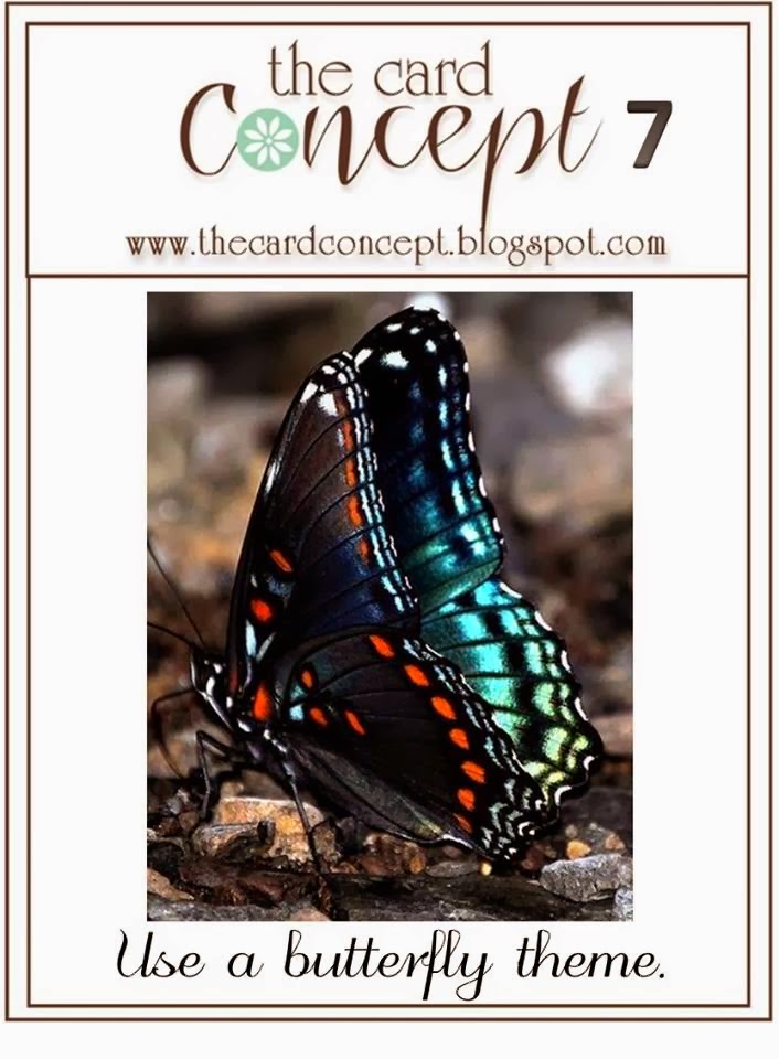
And the last challenge it fits into is a one I've been following for a while but haven't had the chance to join in on until now. The Card Concept. The current challenge over at The Card Concept HERE and seen below, is to use a butterfly. Part of the challenge is to use one of the styles demonstrated by the designers. I chose Clean & Simple!
On Tuesday I announced a double GIVEAWAY one HERE on the blog & one HERE on the Uniko Studio Facebook Page. All you have to do is comment on each post to be in the chance of winning. You have until 9am Friday 4th April to comment & I will draw the winner shortly after & announce them on the blog & Facebook.
Tomorrow we have a guest designer joining us for the Uniko Studio Challenge #8 reminder, so be sure to stop by and see how the guest designer Laura has interpreted the challenge. Until then, thank you for stopping by today :)
Supplies
Card Stock: White (Boyes)
Ink: PTI Summer Sunrise & VersaFine Onyx Black
Stamps: Uniko Studio Flower Power #1 and BRIGHT Butterflies
Accessories: Sizzix Framelits Square Dies & Adhesive Pearl


I adore your ultra CAS look and that one little gem is just perfect x
ReplyDeleteWell; this is really ULTRA! There;s not much less you can put on a card so it stays a beautiful card like this one! Hugs, Gerrina
ReplyDeleteThanks Bev for the visit! Seems as if the two of has the same idea combining the 2 challenges!
ReplyDeleteI love your version! I picked that butterfly stamp as part of my prize from Casology for the challenge you sponsored... will definitely use it soon 'cause it's just lovely!
Lovely card!
ReplyDeleteGroetjes, Maaike
Oh my, just when I think you've peaked you go and better it. Love this card for its complete simplicity!
ReplyDeleteBeautiful card, I love the window you created. Perfect CAS card, thanks for sharing!
ReplyDeletevery pretty card...
ReplyDeleteGorgeous card Bev. Really love the window style you have used. Reading your post, I was thinking to myself that I always look forward to seeing what the guest designer has created..... Then remembered its me! Doh!! One of those weeks!!!! Xx
ReplyDeleteUltra CAS equals ultra perfection in my book Bev.
ReplyDeleteSwooning over the elegance of this card, Bev. I sooooo love my butterflies and each time I see you use them, I fall for them just a little bit more. Gorgeous card; amazing inspiration! Stunning simplicity once again!
ReplyDeletec
What a sweet "peek-a-boo" thinking of you card, Beverly!
ReplyDeleteSo pretty. Love the little window.
ReplyDeleteStunning, elegant, beautiful .... What more can I say!
ReplyDeleteElaine
Such a pretty CAS card.
ReplyDeleteOfsetting the butterfly like that has made all the difference.
Caroline xxx
So pretty!
ReplyDeleteBev this is so beautiful. Thank you so much for sharing with us the Card Concept!
ReplyDeleteCAS perfection...really pretty!
ReplyDeleteWow, how perfectly CAS is this! So beautiful :)
ReplyDeleteReally great CAS design, Beverley! I love the butterfly tucked in the corner of your square window. Beautiful! Thanks so much for joining us at The Card Concept!
ReplyDeleteLovely CAS card x
ReplyDeletelove this! so simple and perfect!
ReplyDeleteI love the cropped butterfly in behind the clean frame Bev. Perfect CAS card. Thank you so much for joining us at The Card Concept.
ReplyDelete