Thursday, 26 May 2022

Brand Ambassador Inspiration - WILD

Good morning

Anita here with some inspiration for you.  More often than not when crafting I reach for florals so I decided to go off on a tangent this time and picked out the WILD clear stamp set and a couple of co-ordinating stencils.


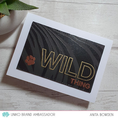
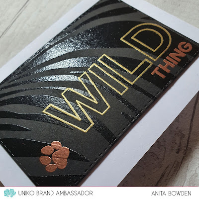
For my first two cards I combined the stamp set with the Tiger Print Stencil.  Here's the first one...


Rather than go with the traditional tiger stripe colours I thought I'd try tone on tone with black, and I love how this turned out.  I laid the stencil over some black cardstock and pressed through it with my VersaMark ink pad, going over it a few times to ensure all the areas were covered.  I then heat embossed the stripes in black, but this would work equally well with clear embossing powder too.  I die cut the panel with a stitched rectangle and then went over the surface with an anti-static powder tool before stamping the sentiment and paw print also in VersaMark, which were then heat embossed in gold and copper.  I then popped the panel up on 3D foam onto my card base.


And for my second card, a one layer card with a completely different feel using the same Tiger Print Stencil...


This time I used a heart die to make an aperture out of a scrap piece of card and used this as a stencil.  I ink blended onto my card base, first with Kitsch Flamingo Distress Ink, before placing the Tiger Print stencil over the top and inking over it with a Festive Berries Distress Ink.  I then simply finished by stamping the sentiment in black and adding some gems.


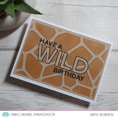
And for my final card I combined the stamp set with the Giraffe Print stencil...


I began with a die cut panel of light coloured kraft cardstock and stamped the word WILD in the centre.  I then masked the inside of the letters, by cutting out the sentiment which I had stamped onto post-it notes.  Next I masked off around the edges of the panel to leave a slim border and then ink blended through the Giraffe Print stencil using Distress Inks in Tea Dye and a touch of Rusty Hinge.  When all the masks were removed I then stamped the remainder of the sentiment in black.  To help the sentiment to stand out a little I added some Wink of Stella for some sparkle.


I had great fun making these and I hope you like them.  There is a third stencil in the series, the Zebra Print stencil, which I'm yet to get my hands on.  It's currently out of stock but please do check back at a later date if you want that one, I'm sure Bev is working to get this one back asap.

Thanks so much for joining me today, I hope to be back with more to share very soon.

Take care


Tuesday, 10 May 2022

Brand Ambassador Inspiration - Passiflora & BB Grid

Hi everyone, 

Steph here with my Uniko Brand Ambassador Inspiration post for May. And I also add that May is my one year anniversary of becoming a Brand Ambassador for the wonderful Uniko. Where has that time gone?! 

This month I’ve dug out the Uniko Passiflora stamp set because it’s one of great beauty but I haven’t played about with it nearly enough. 

I really like florals teamed with geometrics and when I first saw the Uniko Background Blocks Grid stamp it reminded me of garden trellis so I think it’s a perfect match. 

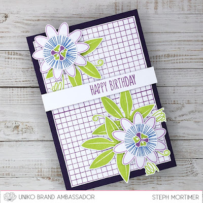
My first card uses the BB Grid stamped twice which rather nicely fits an A6 card front. I stamped my Passiflora in the most common colour way leaving the petals white but adding a purple edge by stamping with the outline stamp only. Each layer of the flower is stamped, cut and adhered using either double sided tape or foam pads for depth. The leaves and ‘twirls’ are stamped in my favourite green and arranged around the florals. An addition of sentiment from the Uniko Floral Vines stamp set, which is raised up on foam pads, and the panel was adhered to a purple card blank. 

My second card uses a single grid which I have offset as I wanted the florals to take up the main focus of the bottom right of the panel. This time I used the colours of a pink Passiflora and again the layers are adhered using both double sided tape and foam pads. 


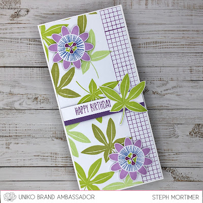
My final card is a slimline and I wanted the leaves to shine out here. I’ve stamped them in three shades of green before adding the BB Grid along the right hand edge. I then stamped the Passiflora in a purple colour way and one more leaf! I adhered the sentiment using foam pads and then added the leaf on too. After adhering the florals I added some drops of glossy accents to the middle stamen. They look like dew drops in the morning!

All the florals are shaped with the petals curved backwards which has not shown well on the photos but looks great on the cards. 

Thanks for joining me today and I hope you like my three ways with Passiflora. As always I had a lovely time inking these stamps and I know I’ll be coming back to them again soon. 

Much love

Steph x


Friday, 6 May 2022

Inspired by an Instagram Poll!

 Hello & Happy Friday!


The other night I created a series of polls on the Uniko Ltd Instagram stories, as I needed some help sparking some creativity. I've been busy designing new things and finalising the next release coming at the end of May. So my actual creative time has been on a bit of a go slow :(


So I created a series of polls to help inspire me...


First I asked what I should use. Stamps Only, Stencils Only, Clear Stamps & Matching Dies or Combination of All! 


Next I asked who I should create for, Men, Women or Gender Neutral. And then I gave some theme options. Florals, Geometric, Sentiment Only, Combination of All.


Then there were some colour options. Monochrime, Rainbow, Neutrals, Pastels. 


And lastly I gave some card style/size options. Standard C6, Square or Slimline.


If you don't use Instagram, stories stay up for 24 hours and then disappear. Luckily, I can view the results in my insights and could see what had been decided.

A combination of Clear Stamps, Stencils & Dies to create a gender neutral geometric card with a monochromatic colour scheme and a 3 way tie between card size/style!

At first I was a bit, oh no what have I done - haha! But then I got my thinking cap on and had a look through my Uniko goodies and this is what I came up with.


As there was no clear winner for the size and style of card I used the same products, almost the same way to create the same card on each size. 

I started with a standard C6 card.


For my stencil choice I went with the Mid Century Modern Shapes. I used a selection of grey inks from Altenew to ink through various shapes on the stencil, over lapping some to create a cascade effect down the left hand side.


I then selected the Background Block Arts Decoratifs and stamped this in black ink. The hardest part was using a geometric die. I thought about using the Explosion! Designer Dies, but I didn't want to cover up too much of the design.


In the end I decided to use two square dies to create my own frame. This worked well, but the card needed something to finish it off. I decided to use a trio of sentiments from the Simply Said Blocks and Simply Said Blocks II clear stamp sets. A few final Nuvo Drops and I was finished!

I then followed the same process to recreate the design onto a slimline card.


The layout changed slightly to accommodate the elements and for it to flow nicely down the card.


Lastly I created a square card.


It was quite fun to be faced with a challenge. I hadn't really thought of the possible combinations that could occur, but then that was part of the fun! 


So now the question is, which is your favourite of the 3 cards using this combination of products? And did I achieve the brief?

I'd love to know your thoughts. 

Crafty Hugs 


Wednesday, 4 May 2022

Brand Ambassador Inspiration - Using Pure Florals Rose

  Hello!

It's Jane here today sharing a birthday card I created using Pure Florals Rose as a focal point on top of a inked background diamond.


I started by creating a stencil from paper using a square die to create the aperture. I then placed this over the card top and inked through with two shades of distress oxide ink - kitsch flamingo & festive berries.

Before removing the stencil I used the Background Blocks Solid Wonky Stripes stamp placed to one side and stamped it using nocturne Versafine Clair ink.


Next I stamped the smaller outline rose from Pure Florals Rose and cut it out by hand. I popped it up onto foam pads and then attached it on top of the inky diamond. I really love the look of Bev's florals without colour, I think it really showcases the fine detail.

The sentiment is from Simply Said Blocks and to finish it all off I matted the whole thing onto a slightly larger card base.

Thanks you so much for looking today, I really appreciate you taking the time.

Stay safe and keep crafting!

Jane
x

Tuesday, 3 May 2022

BA Inspiration, Combining sentiments from more than one set

Good morning all, Julie here with some Brand Ambassador inspiration. 

Do you find masculine cards difficult? I love making cards for blokes just as much as for the girls, until recently the boys outnumbered the girls in our family! My go to style for masculine cards is CAS and the choice of colours also plays a part, bold bright colours work well for masculine cards. So here's a simple idea that you can use over again, just change the sentiment!

Over at Cardz4Guyz their new challenge theme is something beginning with D, so I chose Die Cuts and used some Uniko sentiments to create my card focal point. As I made quite a few extra die cut shapes, I decided to make a few more cards with them and share them with you here.

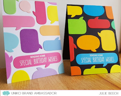
Here are the first two, the bright one on black I used for the challenge at Cardz4Guyz and the other I made with the more pastel tones on white for a feminine take. The layout of the die cuts is slightly different but the sentiment is the same.

To begin, I selected a few different sentiment stamp sets which I could combine to make my sentiment phrase. For these two cards I selected Everyday Sentiments, Doodle Flowers and Happy Days. Using a speech bubble die set, I cut a load of colourful shapes from card scraps, waste not want not.
On the long speech bubble, I arranged the sentiment then stamped with Versamark and heat embossed with white EP. I find it easiest to use a jig for stamping on small items, so for this I cut the shape from a piece of scrap card which I placed in my MISTI and arranged the sentiment stamps in the opening. Try test stamping on some scrap to ensure you don't waste the die cut!

Using this stamped bubble as the start, I arranged the die cuts over my A6 base cards, trimming off anything that was overhanging. You don't need to make up your own sentiment phrases, there are lots of ready made ones that Bev has released, but I thought it would allow me to fill the long thin speech bubble.

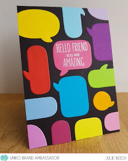
As I had a few leftover die cuts, I went with a different sentiment phrase and layout, this time using a mix of Doodle Flowers and Floral Vines.
It was the same process as for the other two cards, except that the sentiment was in a different place.


This card could be for a male or female recipient really. If you don't have speech bubble dies, you could use other die cut shapes to get the same effect, balloon dies would work well.

OK,  that's all from me for the moment, but I hope I've given you some ideas to create masculine cards and get more use from your sentiment stamps.

Stay safe 'til next time and keep crafting!